
Maria Cristina Bellucci
Necklace: 12 necklace 3 2012
Coloured pencils, silver
Yesterday, 10 students from different nationalities gathered in the design studio on the campus of university of Lincoln with their teachers, sharing their interests on design. It was the first formal discussion of our new module named ‘Graphic Design Creative Practice’. In the discussion, each of us was asked to brought in a book or an article we are interested in and introduced to others the importance of the materials we selected. There are some interesting points I would like to highlight here.
1. The shift from utilizing luxury materials to low-cost stuff (even waste)in jewelry design.
It is stunning to see that the books Gloria and Sissi brought demonstrate a variety of contemporary and modern jewelry which are no longer made of expensive materials such as gold,diamond,crystal or pearl.Instead,materials like colorful pencils,shells and sea weeds are frequently used to provide a novel and unique insights into jewelry design. For example,Maria Cristina Bellucci created a collection of jewelry by using polished colorful pencils.

Maria Cristina Bellucci
Bracelet: Egg 2010
Silver, coloured pencils
Selected for Enjoia’t 2011, Contemporary Jewelry Award, Barcelona, Spain.
The shift of the materials of jewelry design also indicates the change of people’s aesthetic taste to jewelry.However,since the perspectives of design have changed,a new question may arise: what makes a good design? This is a controversial question which is difficult to explain when regarding design as a whole.But the article brought by Melody provided some criteria in terms of logo design.
2.what makes a good logo design.
Jacob Cass proposes 5 general features of a successful logo design, namely simple, memorable, timeless, versatile and appropriate. Based on these five principles, examples of logos of “Coca-Cola” and “London underground” are regarded as nice logos from the author’s point of view.
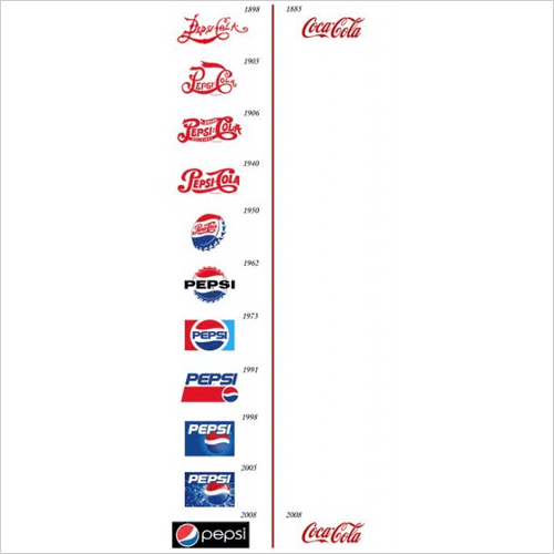
Pepsi vs. Coca-Cola Logo Evolution chart adapted from “Brand New”
It is obvious that Coca Cola doesn’t change lots compared with the logo of Pepsi coke. Just as David Airey suggests.”Trends come and go, and when you’re talking about changing a pair of jeans, or buying a new dress, that’s fine, but where your brand identity is concerned, longevity is key.” Besides, a good logo should also be simple and memorable. Normally, people may not spend much time on a logo and usually they just cast a glance at it when they pass by. Therefore, logos need to be brief and straight forward to convey the message in such a short time, like the logo of “London underground” shows.
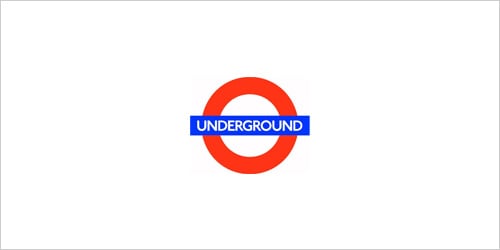
logo of “London underground”
3. A good design may need to be clients-centered.
When Yolanda introduced the article her interested in, she demonstrated a picture of a set of tools specially designed for women customs. The tools are red, lightweight and smart in function which not only manifests the identity of women but also fulfill the functional needs.In my opinion,design should not only take women customers into consideration but also elderly people, kids and the disable to achieve a new humanistic design which makes products or design works benefit different kinds of clients.
Overall, the meeting is interesting and beneficial. We all learned lots from this meeting.